- ALICE IN WONDERLAND
OLIVIA
HOLLAND
15 HOUR EXAM
WHITE RABBIT ILLUSTRATIONS


DEVELOPMENT
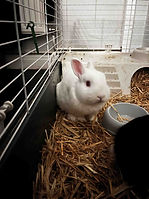
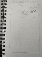
I planned my final illustrations by observing
selection photos of my rabbit photoshoot,
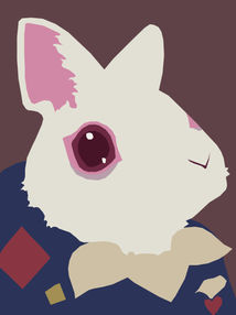
sketching out the white rabbit based on those,
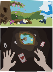
as well as drawing a rough sketch of the scenes.


I then started creating the designs on illustrator (separately), starting with the outline and adding a base colour layer underneath. Below I have included the outline, colour layer and the original design from illustrator before rendering on photoshop. Using photoshop I added depth using the fill tool, image and adjustment tools (e.g. brightness, contrast, vibrancy, colour balance), Filter gallery (e.g.grain, craquelure) for texture, smudge, and gradients. I also used blur tools such as motion blur so that Alice appears to be falling in the scene.
'ALICE IN WONDERLAND' TYPOGRAPHY

I created this typography as an illustration to encapsulate all of my work in this project (for example a teacup for the mad hatter) and
introduce the theme to
viewers. I have created a playful type to reflect the whimsical nature of my theme.

This is the original illustrator outline before the addition of a colour layer and shading on photoshop.
I changed the second D to a clock to represent the white rabbit between this and the final design.
FINAL EXHIBITION PANEL

This is the layout of this project for the exhibition. I attempted several layouts and chose to line up the designs along the centre of the panel. I several backgrounds (white, gradient) and found black creates the most contrast and draws the eye towards my illustrations the most.


